Creating an Exceptional Website: Eye-catching Design, Seamless Usability, and Memorable User Experience 👌
Nowadays, your business needs an exceptional website—not just a website. There are some principles you have to follow to create an effective website.
These guidelines will help you build a website with an eye-catching design, seamless usability and a memorable user experience.
9 proven web design principles for you:
Your website is the face of your company in the digital world. A great one will leave a compelling impression on your customer (or potential customer).
Surprisingly, the opposite of a compelling impression is an indifferent impression—where the customer won’t even remember your website or business because it left no impression on them. This is what we want to avoid at all costs. Be it positive or negative, leaving an impression makes a big difference in the general awareness of your business.
Here we uncover the nine widely-used principles of building an exceptional website—one that will leave a lasting impression on your customers.
-
Mobile-friendliness 📲

Image source: NeONBRAND on Unsplash
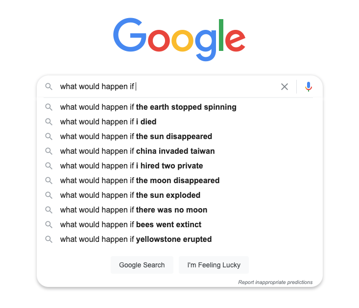
Everyone owns a smartphone. Everyone surfs the internet daily – whether it’s Facebook, Instagram or Google-ing “what would happen if…”.
This is why creating a mobile-friendly website should be on top of your priority list. If people access your website more through their smartphones than their desktops, it needs to function efficiently on the device and leave an impression.
Designing a mobile-friendly website is also in line with Google’s plan of mobile-first indexing. Through mobile-first indexing, Google mainly uses your website’s mobile version to index and rank your page.
If you neglect the mobile version of your website, you may miss on the potential customers that come to your website through Google because it is the world’s biggest search engine, dominating 86.6% of the global search market share.
-
A moderate number of colours 🟦🟪🟩🟨
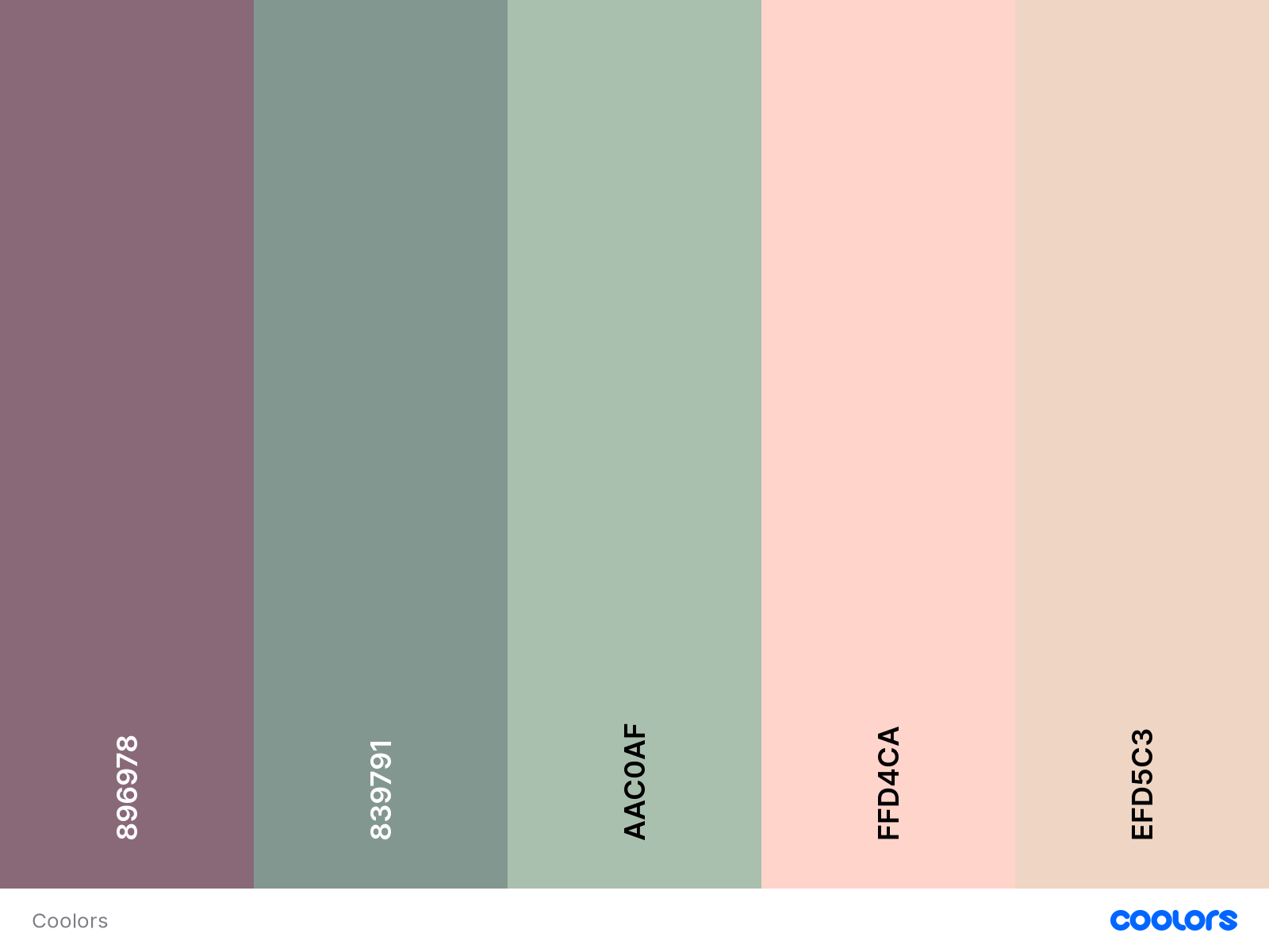
Image source: Coolors
Colours are fundamental. They communicate, they represent, and they catch the eye. However, the best practice for your upcoming website design is not to overuse colours. Use a moderate number of colours and use them wisely.
Commonly, a website needs a maximum of five different colours—one primary, two secondary and two additional colours. These can be mixed and matched on the website, creating a theme that helps customers identify the brand just by the colours.
-
Clear typeface 🔠
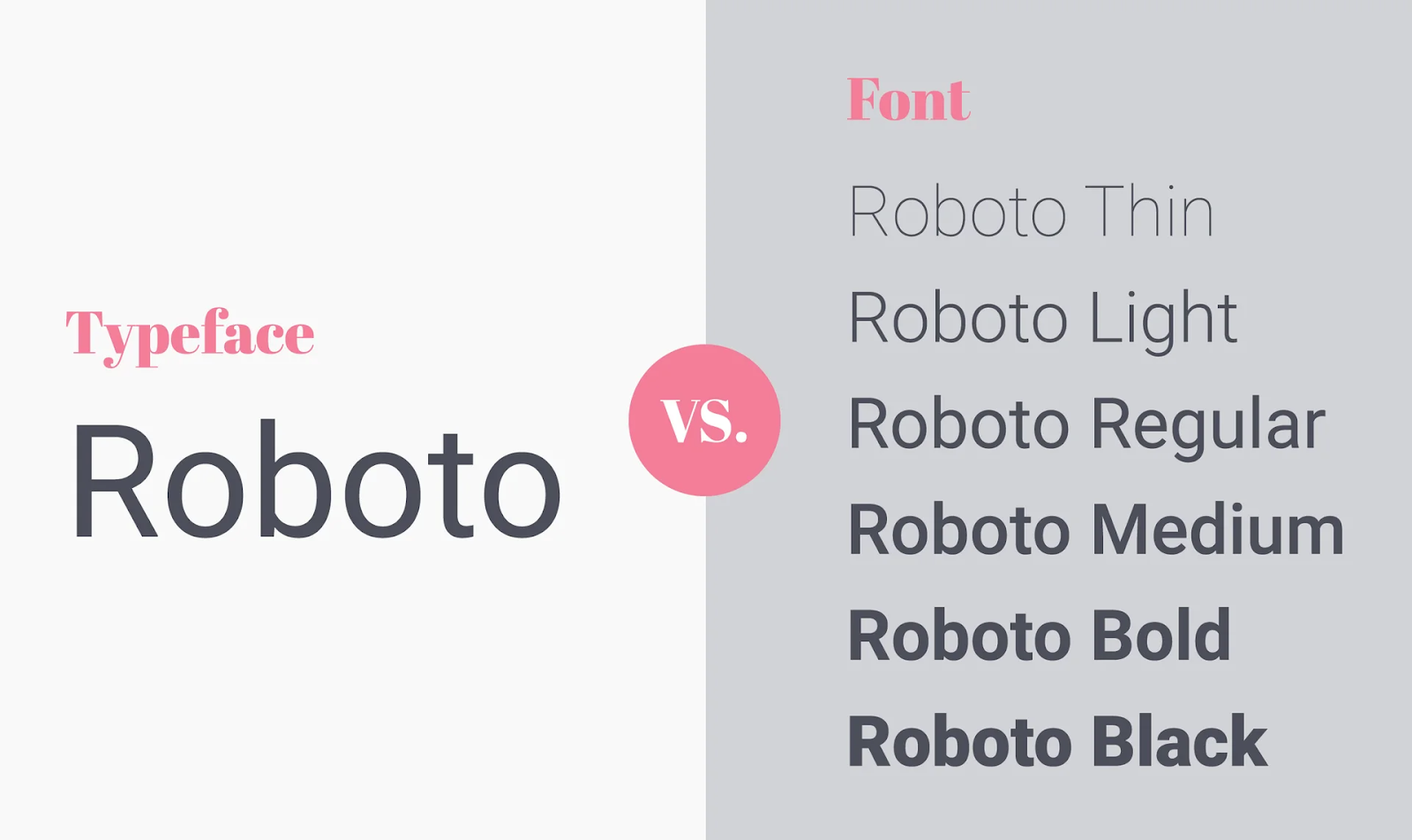
Image source: Snowball
A typeface is a term for a group of related fonts. It is a group of fonts that you will use for your website.
For example, you decide to use a Roboto typeface for your upcoming website design. That means you will use fonts from the Roboto font family – Roboto Light, Roboto Regular, or Roboto Medium, on the website. A clear typeface will also add to the identity of your brand when used consistently.
Also, more than 95% of information on the web is in the form of written language. That means your typeface should be optimised for readability, usability, and overall graphic balance.
Too many fonts will end up fighting each other for attention because each typeface has its weight and style—like how ‘Impact’ is overshadowing ‘Baskerville’ in the same space.

-
Meaningful graphics
Graphics are powerful means to communicate your intent or show items of interest to users.
However, they can also backfire—because graphics will make the website load longer if they are not optimised properly. People would rather close their browser than wait for an extra two seconds for your page to load. So, you need to make sure you don’t lose users in that process.
Therefore, add excellent graphics but keep in mind to add them only when they have a purpose on your website.
-
Visual hierarchy in harmony ✅
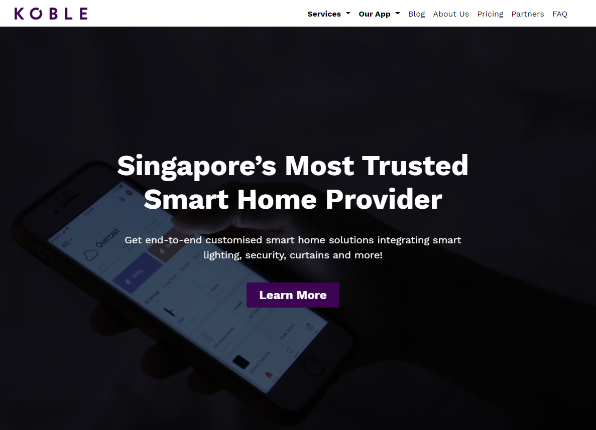
A good website design should blend well. Everything on the page needs to be harmonious—the text, the visuals, the colours.
The best practice for the visual hierarchy of your website is to arrange and organise the important elements of your website deliberately. By organising them smartly, you can direct them to the important elements naturally.
For instance, let’s take a look at the website of Singapore’s smart home provider, Koble. The main heading (“Singapore’s Most Trusted Smart Home Provider”) sits on top of the sub-heading. You will naturally see this heading first when you load the page and will instantly know what the page is about.
Then, your eyes will be drawn to the call-to-action (CTA) button next, one of the most critical elements of their website. The CTA button with a bold purple shade will prompt you to click on ‘learn more’ so you can be directed deeper into the site.
And, all these elements are in harmony—they are bold, but they are easy on your eyes. All these elements look natural and provide sufficient information at the same time.
-
A consistent look and feel
Consistency is crucial for your brand and your website. Be consistent with the elements on your website, such as:
- Colour schemes
- Typeface
- Tone of writing
- Illustration style
- Buttons
A consistent look and feel will create an image and personality for your brand and induce a positive user experience and unrivalled interface.
However, this does not mean that you only use one layout for the content on your website. You can explore different layouts for your website pages using the same colour scheme, typeface and illustration style. This will create a theme for your website, keeping it consistent.
-
Intuitive navigation 🧭
Users are very impatient. When they find your website is difficult to use or cannot find the information easily, there is a fat chance that they will close the browser tab and find the information or product they need on your social media or, worse, your competitors.
Hence, a website should be easy to navigate. It should predict what the user is looking for and follow a layout made for the user. This intuitive navigation will help users:
- Effortlessly find crucial information they need very quickly
- Moving between different pages easily
- Grasp the idea of a page within the first 10 seconds
-
Conventional design
No, a conventional website design is not boring—it is practical and effective for your users. The conventional design combines forms and functions. They are proven to bring a positive experience and easy usability for your users.
Some proven conventional design principles that you can use for your website are:
- Main navigation at the top left or right of your website
- A clickable logo that will bring users back to the homepage
- Logo placement at the top left or centre of a page
- Colour change on hover on links and buttons
- Shopping cart icon for an e-commerce website
- A number badge showing items in a shopping cart
- Buttons for image sliders on your website
- A ‘back to top’ button
-
Trustworthiness 💰
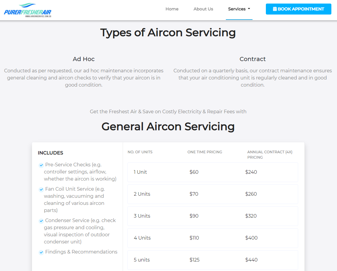
You need to make sure your website is trustworthy and that users will take your information as the truth. Kickstart the trustworthiness of your website by being honest with your product or service.
Let’s look at the above example from Purer Fresher Air, an aircon service contractor in Singapore. Their service page lists a clear pricing table and an upfront explanation of what the service includes.
In addition, if there is a financial transaction on your website, it is best to double-check if the process will be secure for both you and your customers. Be sure to display all the verification badges to ensure that your customer trusts your platform during financial transactions. If their trust wavers, they will discontinue any purchase from your website.
A quick recap of 9 tips for your website:
- Mobile-friendliness is your utmost priority
- Experiment only with a maximum of five colours
- Use easy to read typeface
- Optimised graphics that speak a thousand words
- A harmonious visual hierarchy
- A consistent look and feel throughout all the pages
- Easy to navigate
- Following a conventional design; trying to reinvent the wheel in website design could backfire on you
- Be trustworthy
Ultimately, when you relaunch or redesign your website, it is for your users. They should be your main priority when creating a website with great design, usability, and user experience. Try using your website from the eyes of your customer; you might be able to optimise it better!
And if you need an exceptional website, we can help you. Let’s talk with us by tapping that WhatsApp button. Aiden Creative has been developing outstanding websites since 2012 for businesses of all sizes.
